When it comes to choosing a specific colour scheme, there are so many different shades and tones to experienment with. However, do we ever stop to think of people see when they are colour blind? Designers dont consider what the populations see’s, as long as it looks professional to viewers with normal eye sight. I would like to demonstrate what people see when it comes to choosing a certain colour. I have found a specific website that shows people what colour blind people see everyday and the difference in colours, compare to exactly what we view.
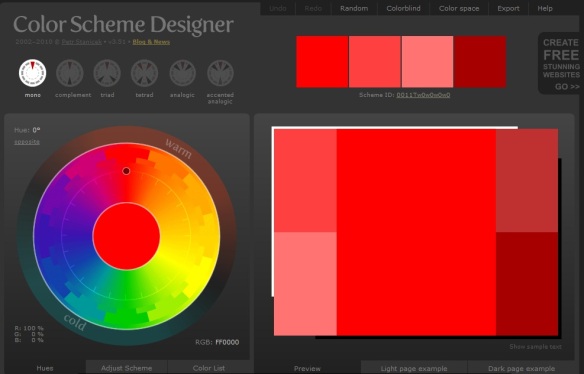
This normal vision (85.5% of the population) will see this bright colour red.
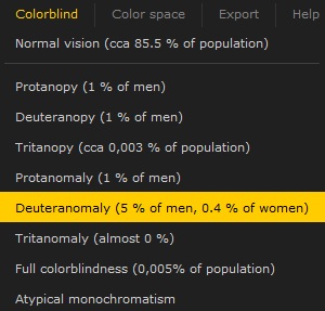
 This is a drop down menu on http://colorschemedesigner.com/# where it lists all the types of colorblindness found, and the percentage of the population who has that specific blindness. This is extremely helpful, as not only will i be able to find out the types of colour blindness but the facts and percentages behind it, increasing my knowledge of how to design a successful product.

The types of colourblind are the following:
- Protanopy (1% of men)
- Deuteranopy (1% of men)
- Tritaopy (0,003% of the population)
- Protanomaly (1% of men)
- Deuteranomaly (5% of men, 0.4% of woman)
- Tritanomaly (almost 0%)
- Full colorblindness (0,005% of population)
- Atypical monochromatism
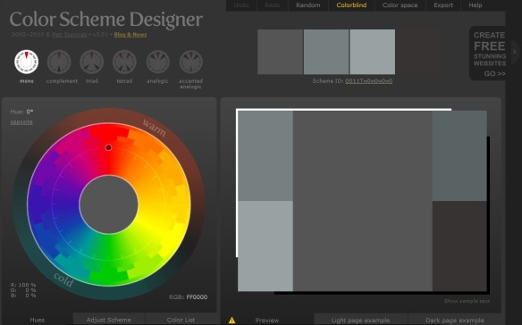
 Looking at the reuslts from the bright vibrant red from a normal vision and comparing it to someone who is completely colour blind is shocking. I would have never thought that red could look anything like a dull colour grey. You would have thought orange or something similar would be the result. However from this investigation the different shades of greys and browns still contrasts well together, keeping the colour scheme consistent and therefore I will still keep the red colour scheme as from a colour blind vision, it still looks neat and professional.
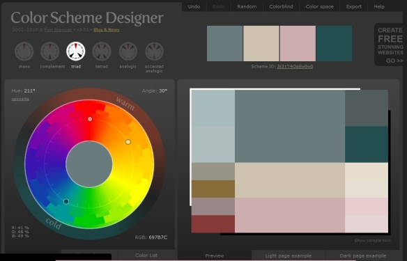
Deuteranomaly (5% of men, 0.4% of woman) (PrntScr below)
 The result from the highest blindness came back interesting. The colour scheme is extremely random compared to the other results. I haven’t changed the hue or contrast of the red chosen in the previous examples. But amusingly the colour scheme appears to be combined using hints of reds and pinks whilst still seeing some sections in grey and green. Like people who have Deuteranomaly blindness are half colour blind but still see selections of colours but not clearly. From observing the combination of the colours in this chart, the colours do sit well together, not too hard on the eye, however could be confusing to some people. However the minor percentage of people who see this colour scheme will be greatly lower than people with normal vision, therefore after carefully considering other peoples visions, I have decided to sick with a professional clean colour scheme of reds, grays, blacks and whites throughout our ancillary task, as the colours chosen don’t affect a wide variety of people in a negative way.
