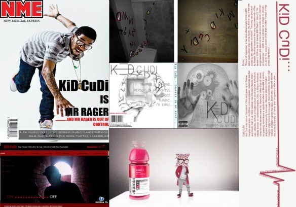
- A homepage for the band
- Magazine front cover
- Advertisement
- CD Cover designs (Digi-Pack)
Category Archives: Design
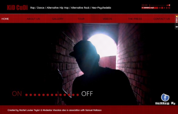
Our final homepage design
Homepage:
This is the homepage of our website! We wanted to give it a very modern, sleek and sexy twist you the sites design to make it appealing that also represents that artist. As Kid Cudi is a young hip/hop stylish type of guy we wanted to signify his personality and identity towards the layout and colour scheme. We have used our main artist who will be representing Kid Cudi on the Homepage instead of Kid Cudi himself. We wanted to include music onto the homepage so the users can immediately hear the most popular tracks and of course the new song with an unofficial video that we had created. We inserted 5 Kid Cudi’s songs in total which is set as a playlist so the music will play continuously throughout the site. If the user decides that they do not want to listen to the songs we have an music equalizer located on the top right of the page so they can simply click on a On/Off button.
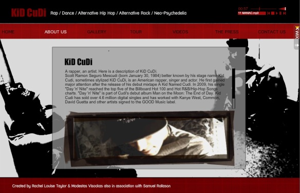
Band Info:
We used some basic knowledge on Kid Cudi which is going to be all located on this page. Everything the fans will need to learn about the artist, to help increase their knowledge of Kid Cudi as a solo artist and how he has evolved from an ordinary guy to a famous celebrity.
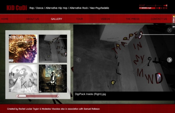
Band Photos:
This page will have all the albums that Kid Cudi has ever created, so the audience can identify the released albums and help promote the songs. It also has some the designs which I have designed and created on Photoshop, etc which will help add to the small collection of his albums.
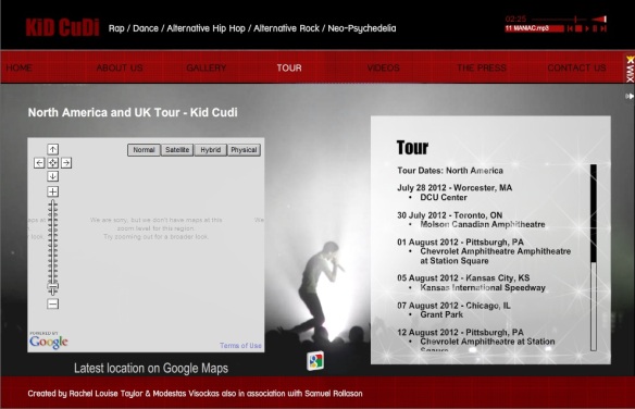
Tour:
This page will have all of Kid Cudi’s tour dates which people can be aware of, helping promote his concerts which are very useful for any band or artist to get more fans and recognition. It’s the tours that give the artist the most about of money therefore it’s important to have tour and dates within a website. Unfortunately our website isn’t going to be advanced enough for the booking tickets physically functional, so the fans won’t be able to order anything from out site; however it will make them aware of when to book tickets, which is just as effective.
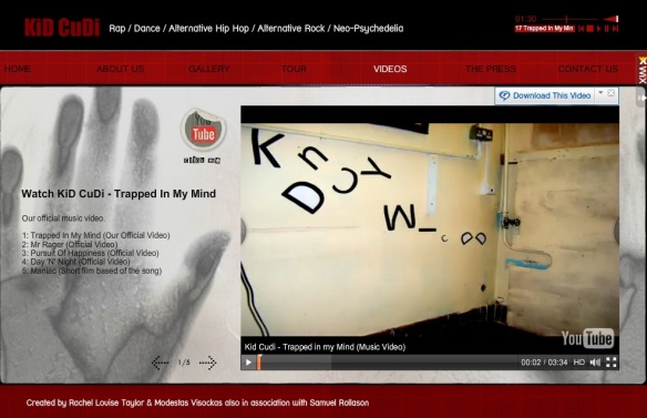
Videos
On this page the final official music video will be located clearly. The aim and purpose of this page is to attract the audience to view the new video and make them want to download the single. We have also used an external link to YouTube so people can comment on the video etc on the YouTube site.
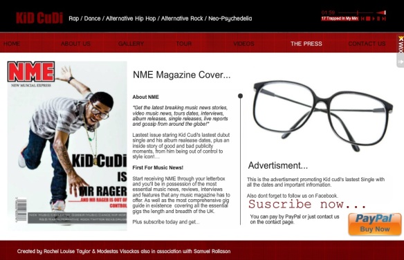
The Press
This page I have made some advertisements and a magazine cover that will help promote Kid Cudi’s latest releases and the official music video to develop recognition. I have decided to follow the OCR brief and designed a magazine cover for the DVD that will be eventually be constructed and an advertised poster that will be located anywhere to make the audience aware of the new release of the music video and single. The information is clearly structured making the user more aware of our magazine and also shows that we used a range of different Ancillary texts.
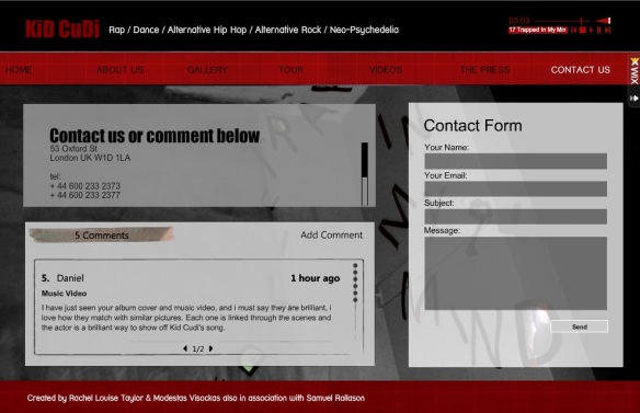
Contact us:
This page is simple and easy to use. We have made this page neat and clean and still kept a consistent theme. By having the use of this page it will allow the audience of this website to contact us, if they have any other queries about the information held on the website and give us some feedback, which we can consider. Therefore this page will reassure the target audience that they can contact us if needed.
This image is currently from our first filming day when we decided to use stop motion for our introduction scene.
Website: http://www.wix.com/modeyv/kid-cudi
Overall I am extremely pleased with our unofficial homepage as it had a wide range of feathers included making the website full functional and proffessional.
The features that we used include the following:
- YouTube
- PayPal
- Google maps
- Gallery
- Tours updates
- Discussions
- music
Music – Band Homepage Design Analysis…
http://prezi.com/ucrcurummdah/edit/#0_27193272
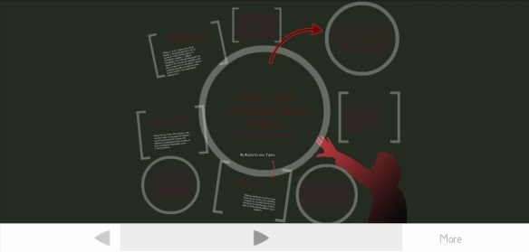
This is a screen shot of my Prezi Presentation that I made, about music – band homepage, design and analysis. I wanted to use Prezi as it was a new professional way of creating a fun presentation about my chosen subject. Therefore I felt that it would be a great idea to do a presentation instead of using power point which also added a different media technology into my coursework.
Digi-Pack Improvements
After some research on peoples opinions on our desired digi-pack, we realised a few improvements could be made and finalized before getting professionally published. The back cover was mentioned a lot from the feedback we received, as not many people liked the lost ghost in the background. Therefore I wanted to consider the feedback comments critically and improved the back cover, by using one of our first designs, which was initially meant for the front cover previously, I manipulated it so it becomes relevant for the back cover image. Not only did I want to manipulate and edit the back cover, I wanted the edging to contrast more spontaneous on the sides, making the title stand out and blend in with the front and back cover.
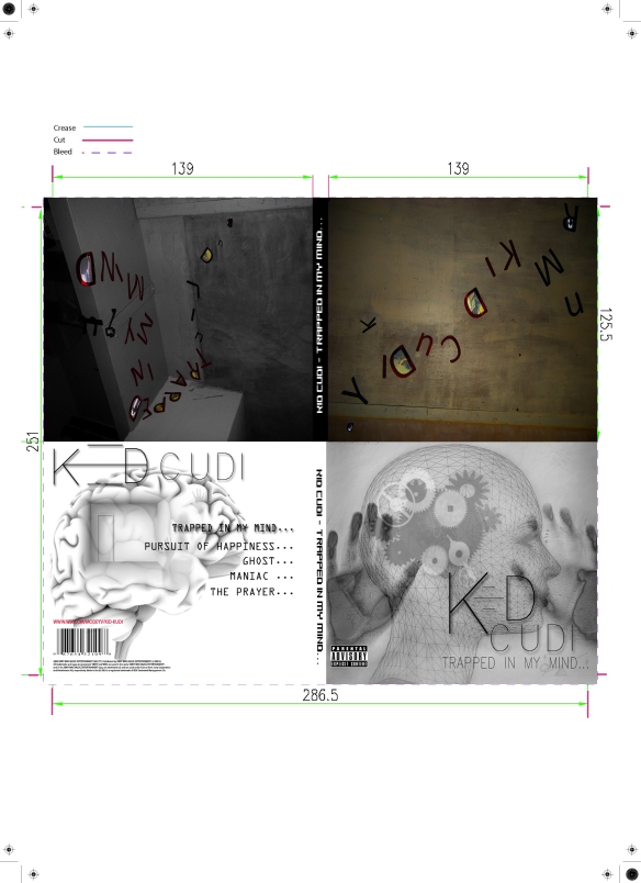 We are extremely happy with our final Digi-pack design, however we do feel that we should have had a proper image of the Artist (Dominic) for the front cover. Unfortunately with major problems with Doms availability and access, we could physically not take the images of him before the printing release date. So for our website, we shall not make the same mistake and take professional images of Dominic when he is next available.
Overall, I love how we used photo manipulation and illustration for our main Digi-pack design as it represents our narrative of our media product clearly and effectively.
Digi-pack feedback…
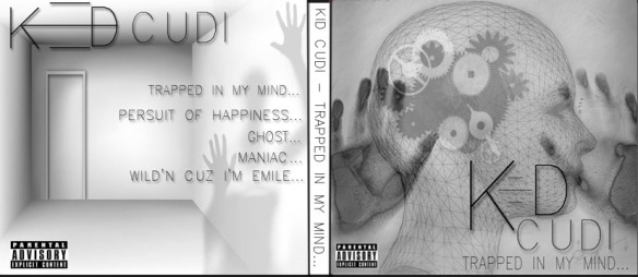
Desired Digi-pack design:
External:
For the front and back cover to the album I’ve tried to keep them looking very similar so the whole house style is consistent. I believe that this design will look very attention grabbing compared to the other CD albums out there on the shelves of stores and markets. Therefore with this unusual design it will be successful in the music market industry.
Internal:
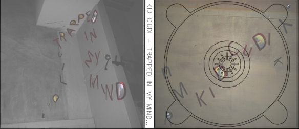
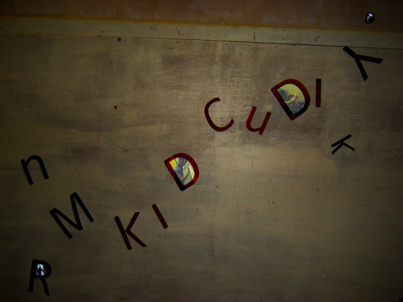
This is the internal design of the finished Digi-pack. Ive really tried to keep the design very simple with meaning still within in. For example we used the lettering from the beginning of our music video and use these words to be creative. The initial idea was to have the artist name shows in the lettering then insert shots of Dom representing Kid Cudi, within specific letters. The colour of the inside contrasts well against the front of the package and will look really effective once the CD Rom is allocated inside.
CD Rom:
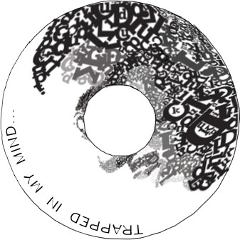
This is the CD’s final design which i think stands out from the rest of the digi-pack as the bold scattered letters look really eye-catching and original. The name of the song is located in a clear blank space, preventing any confusion from the rest of lettering in the Kid Cudi image.
Improvements/things to consider:
- Brighten up the interior images
- Back cover appears to be a bit messy and unprofessional, maybe create a more simply background so the text is more clear.
- Doe not need ‘parental advisory’ logo on both sides of the CD cover
- Needs to incorporate copy right law, somewhere on the package
- Bar code must be included
- Front cover is really good, it gives a clear idea of what to expect in the narrative due to the clever use of clocks to represent the brain and hands trying to escape out of the case.
- All the images contrasts really well together, keeping the house-style consistent and professional.
- The font used is clear and easily readable
- The design of the title has been carefully thought through when designed and it really shows.
Experimenting with Photoshop
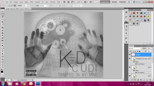
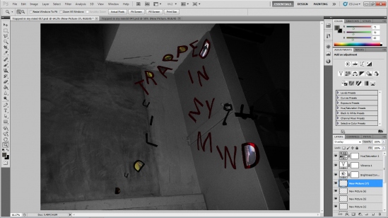
This is a print screen of our front cover digi-pack design built on photoshop CS5. To create this complex design, I had to use a wide variety of layers to add graduate tones and shading to the images.
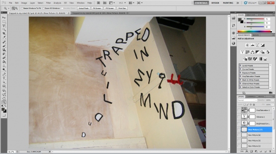
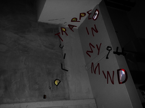
Here I just put the picture that I will manipulate onto Photoshop.
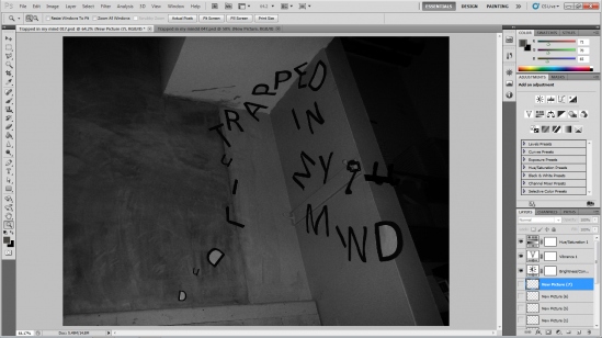
Here I have tested many different adjustments, have found that this black and white adjustment with the addition of more brightness and contrast adjustments has created the best look for this picture. Whilst also linking to the overall cover look and feel based off the front and back covers.
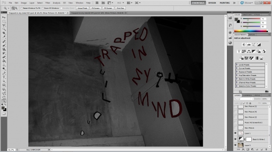
To make the name of the song stand out ‘Trapped in my mind’ I have made the letters into a dark red colour to distinguish them from the other letters present in the picture.
I have added pictures of our actor ‘Dom’ inside the letters to create a cool effect, some of the pictures are straight from our music video. I had to crop and resize all the pictures, and use layers to place the pictures inside the letters, I decided to place the letters inside the pictures with the white fillings.
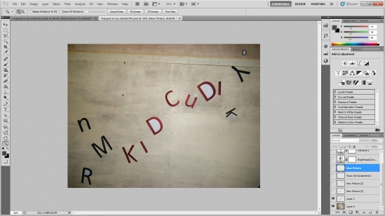
Here I have added another picture for the inside cover of our album digipack onto photoshop.
Just like the photo before I have used dark red to colour in the words ‘Kid Cudi’ to distinguish the artist name from the other letters present in the photo.
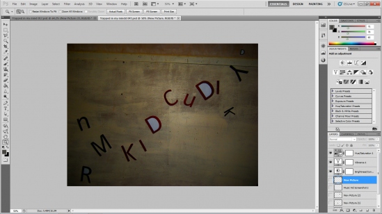
Adjustments needed to be done to the contrast and brightness of this picture to create the best look for the inside cover, the black and white did not fit this picture like the previous picture. Therefore I have used different adjustments to this picture to make it look great and fit the other pictures just as good.
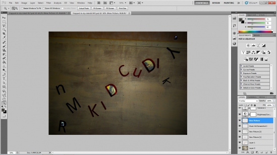
Like the picture before I have inserted scenes and photos of our actor Dom into the letters on the wall, giving the inside of the album digipack and dark and great feel. Whilst still showing what song and artist is inside.
Final Designs for internal sides of the Digi-Pack:
Right hand side of the Final CD cover
Right hand side of the final CD cover
CD Designs
Photoshop CS5
This is a software that I shall be using in most of the designing stages of the CD cover artwork, Band homepage design layout, and promotional uses. I’ve decided to use Adobe Photoshop CS5 instead of Illustrator as im more familiar with this software, and its complex enough to give us the ability to experiment with different photo manipulation effects.
I will be mainly using photoshop CS5 for photo editing only as this is the better software for the job. Whereas, for getting the text and layouts correctly aligned I shall be using Adobe Indesign CS5 as this software is based mainly on layout design.
InDesign CS5
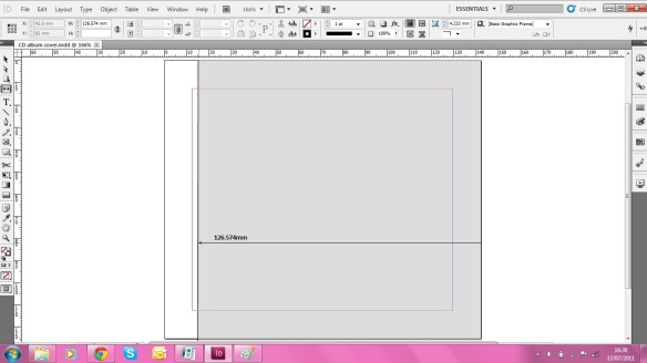
To begin with we opened InDesign package software, the first thing we would need to do before we can do anything is measure the CD cover compartments accurately and get the Photoshop page layout exactly to size, making sure all dimensions have been fitted and measured correctly. We need to do this because when it comes to getting the CD external and internal surfaces printed out commercially we need to make sure we go through quality control and testing using printing marks, etc.
Below is a screen shot of the blank document that will be the basic template to guide us when we are designing.
I’ve measured up each dimension of the front cover and attempted to get it done accurately. As you can tell from this screen shot it is immediately beginning to look like the shape of a CD cover, and its clear to see where the images and texts are allowed to go and where it shouldn’t placed.
Design Ideas for Front cover:
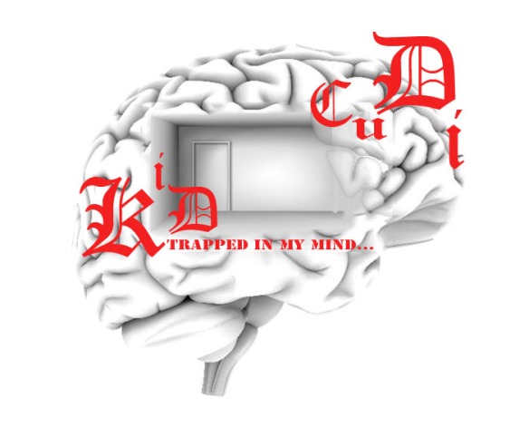
Design 1:
This is design 1, my first attempt to create an Album cover which relates to our song perfectly. I found some images over the Internet and used Photoshop to merge the three images together, to create a meaningful design. I used a very bright colour font which stands out the most in this design and the font is very complex compared to the design, which made the overall impact look unbalanced. I also think that the empty room should blend in more with the brain/mind, otherwise it will look badly photoshop and therefore doesn’t give a very professional appearance.
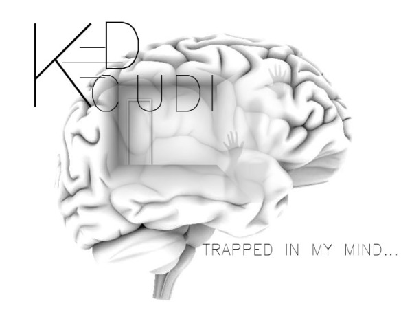
Design 2:
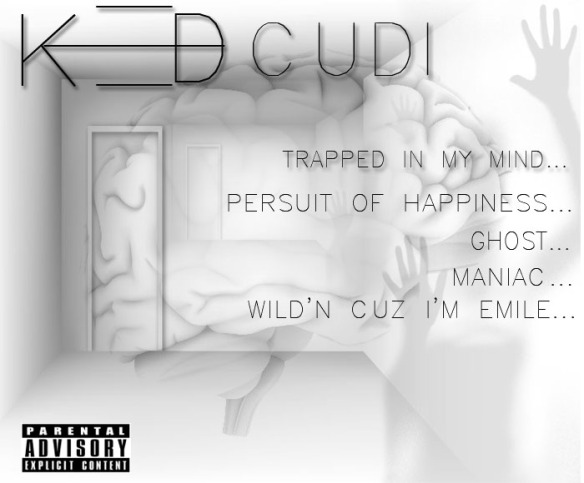
This design is personally one of my favorite designs which I developed from the first design. I still used the same three images but used different editing techniques to manipulate the image. I used different opacity levels and fill levels to make the empty room more merged in the brain. Then I decided to use a dark human figure that appears to be trying to escape, so help it match the character in our music video. I wanted to use a simple font that would look really effective against the image “GTD” was the name of the font that I’ve found which had really interesting shapes and symbols to make up the words. I decided to try this font but using capitals which make the symbols turn into readable typography.
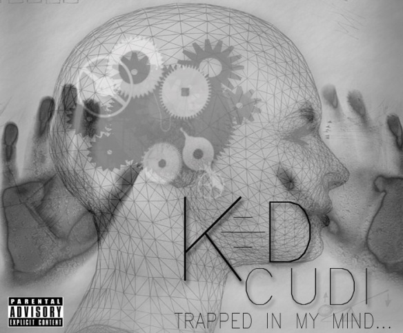
Design 3:
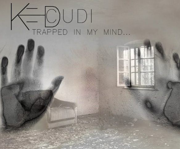
This design is very busy compared to the simplicity of the other designs. However I do like this design as it symbolised the fact that the album is about being trapped in an artisitic layout. I really like the way i’ve used the shaded hands on both edges of the album cover as this could represent a person trapped behind the CD case. Or it could have more meaning to it as the hands can signify the music industry of a working day life trapped in this hetic lifestyle that a celebrity has to face every single day and there is no escape from the paparazzi’s. Therefore the faded hands could somehow represent Kid Cudi trapped in a working day lifestlye which can eventually become his album being published.
Design 4:
Again the same hands are used in this design as myself and my group think it looks extremely effective. However this design doesnt say as much when it comes to the mind situation. Its basically an empty room with a broken sofa and a window which only symbolised the room that kid Cudi is trapped in within the video. But from the first impression of this design i dont feel it has as much meaning towards it than it does in the other designs.
Design Ideas for Back cover:
When it comes to designing the back cover, I find it personally hard to mess around with the page and text layout as music singles tend to only have 1-3 songs on the back which wastes a lot of space. Therefore throughout the designing process of the back cover, we will need to find different solutions to cover the whole page to make it more eye-catching and visual appealing.
Design 1:
On this design I’ve tried to make it look consistent to the designs I’ve created for the front cover. So from using some inspiration from the front cover designs, I thought it would be a good idea to incorporate some of it towards the back cover. We have decided to use the same images from the front cover and duplicated a few images to use more of the page up.
Design Ideas for Booklet:
Exterior
Design 1: This is a design that I randomly came up with from using the potential previous designs combined together. This is the exterior design of the CD booklet:

Interior
Design 1: This is one of the first designs that came into mind when thinking how to design an interior information page as simple as possible.

I really wanted to keep the inside simple but effective from the use of lines, colours and sharpness of the layout. I felt that less was really more in this situation. I really like the straight line which represents an heard beat rate, as I felt this could be incorporated well with the idea of being trapped in his own mind, which makes him crazy, possibly suicidal. We thought we could include some shots that will represent that, for example walking into the light to death.
Colour Scheme Considerations
When it comes to choosing a specific colour scheme, there are so many different shades and tones to experienment with. However, do we ever stop to think of people see when they are colour blind? Designers dont consider what the populations see’s, as long as it looks professional to viewers with normal eye sight. I would like to demonstrate what people see when it comes to choosing a certain colour. I have found a specific website that shows people what colour blind people see everyday and the difference in colours, compare to exactly what we view.
This normal vision (85.5% of the population) will see this bright colour red.
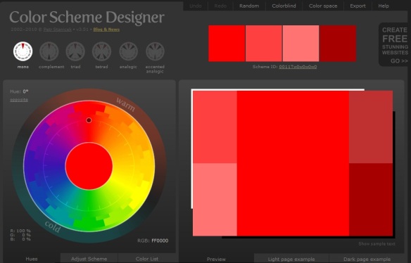 This is a drop down menu on http://colorschemedesigner.com/# where it lists all the types of colorblindness found, and the percentage of the population who has that specific blindness. This is extremely helpful, as not only will i be able to find out the types of colour blindness but the facts and percentages behind it, increasing my knowledge of how to design a successful product.
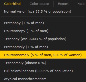
The types of colourblind are the following:
- Protanopy (1% of men)
- Deuteranopy (1% of men)
- Tritaopy (0,003% of the population)
- Protanomaly (1% of men)
- Deuteranomaly (5% of men, 0.4% of woman)
- Tritanomaly (almost 0%)
- Full colorblindness (0,005% of population)
- Atypical monochromatism
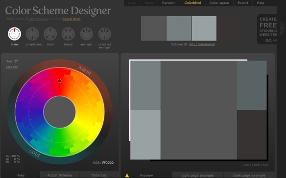 Looking at the reuslts from the bright vibrant red from a normal vision and comparing it to someone who is completely colour blind is shocking. I would have never thought that red could look anything like a dull colour grey. You would have thought orange or something similar would be the result. However from this investigation the different shades of greys and browns still contrasts well together, keeping the colour scheme consistent and therefore I will still keep the red colour scheme as from a colour blind vision, it still looks neat and professional.
Deuteranomaly (5% of men, 0.4% of woman) (PrntScr below)
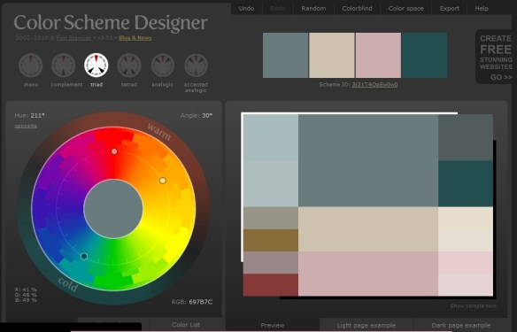 The result from the highest blindness came back interesting. The colour scheme is extremely random compared to the other results. I haven’t changed the hue or contrast of the red chosen in the previous examples. But amusingly the colour scheme appears to be combined using hints of reds and pinks whilst still seeing some sections in grey and green. Like people who have Deuteranomaly blindness are half colour blind but still see selections of colours but not clearly. From observing the combination of the colours in this chart, the colours do sit well together, not too hard on the eye, however could be confusing to some people. However the minor percentage of people who see this colour scheme will be greatly lower than people with normal vision, therefore after carefully considering other peoples visions, I have decided to sick with a professional clean colour scheme of reds, grays, blacks and whites throughout our ancillary task, as the colours chosen don’t affect a wide variety of people in a negative way.
Final Video Product….
This is the final fully completed music video.
Once we had fully completed our media product, Modey had uploaded our music video on to YouTube, whilst the video quality looks good on YouTube some of the lip syncing looks out of place for some reason. In the original this is not the case and the lip syncing matches the song, but on YouTube there is a slight delay.
Animation Software
In this section myself and my group will be looking at different types of 3D animations software’s available that we can self learn during this course to produce an effective finished appearance to our final media product. We thought it would be a good idea to add some scenes that are fully animated to symbolize the difference between realism and surrealism. Therefore, we want to learn another software that we can incorporate in our final piece.
Adobe Flash CS5

Flash enables the ability to manipulate vector & raster graphics to provide animation texts, drawings and still images. It also captures the users imput such as Mouse movements, keyboards, microphones and camera. Adobe Flash strongly contains an object-orientated language called ActionScript that supports automations via Javascript flash language. Adobe Flash is a form of a multimedia platform mainly used to animations interactivity to webpage and other digital devices. Flash is frequently used for different methods of advertisements, games and flash animations.
Autodesk Maya Modelling & Animation Software

AutoDesk Maya is a three dimensional (3D) computer graphics software that runs on Linux, Mac OSX and Microsoft Windows. It was originally developed by a company called Alias Systems Corporation and its now currently owned and developed my Autodesk, Inc. Maya is used to create interactive 3D applications, including video games, animated films, TV series or just simply to create visual effects.
 This is a screenshot of something that is possible to create. From all the icons on display, it indicates the complexity of the software and it will takes years to full learn it. However as a group we are determined to buy tutorial magazines of this software to see if we are eligible to create an functional 3D animation that is suitable & relevant for our music video.
This image of the car looks extremely realistic and professional which shows how good this software is. This software is well known with all the film creators in animated films, as this is the exact software they use to produce the movies.
This is an example of what Autodesk Maya 2010 is capable of creating:
Overall, as a group I believe we will give a good attempt to use these animation software’s that we could use in our finished music video, however it all depends if we can find the time to learn these complex software’s in a few months that will be professional enough to be used. Out of the choice of software, I would like to use ‘Maya’ as it looks more effective but I have had some basic experience on ‘Adobe Flash’, so we shall be experimenting with both software’s and test what attracts the target audience more effectively…..

