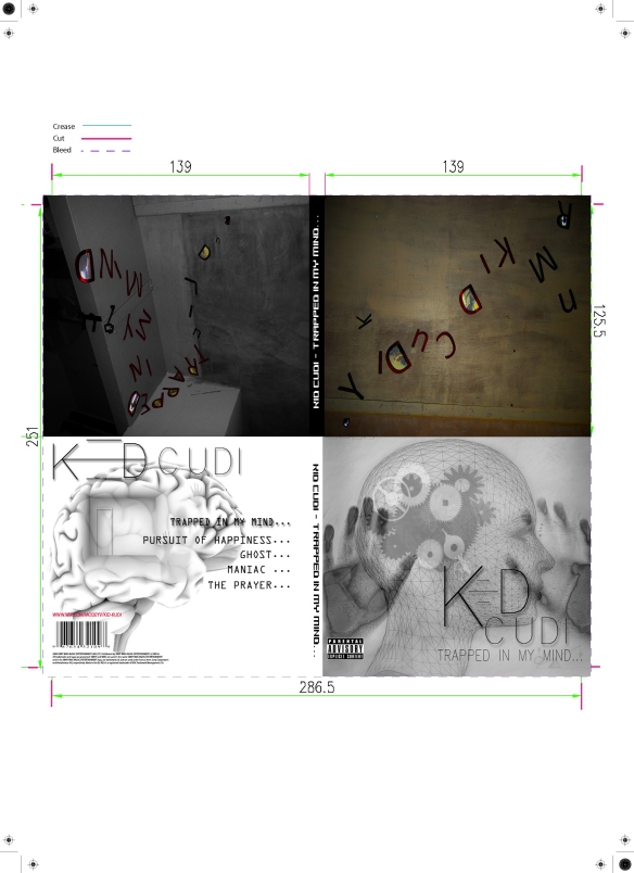
After some research on peoples opinions on our desired digi-pack, we realised a few improvements could be made and finalized before getting professionally published. The back cover was mentioned a lot from the feedback we received, as not many people liked the lost ghost in the background. Therefore I wanted to consider the feedback comments critically and improved the back cover, by using one of our first designs, which was initially meant for the front cover previously, I manipulated it so it becomes relevant for the back cover image. Not only did I want to manipulate and edit the back cover, I wanted the edging to contrast more spontaneous on the sides, making the title stand out and blend in with the front and back cover.
 We are extremely happy with our final Digi-pack design, however we do feel that we should have had a proper image of the Artist (Dominic) for the front cover. Unfortunately with major problems with Doms availability and access, we could physically not take the images of him before the printing release date. So for our website, we shall not make the same mistake and take professional images of Dominic when he is next available.
Overall, I love how we used photo manipulation and illustration for our main Digi-pack design as it represents our narrative of our media product clearly and effectively.
