QUESTION TWO/HOW EFFECTIVE IS THE COMBINATION OF YOUR MAIN PRODUCTAND THE 2 ANCILLARY TEXTS?
Once we had finished with the production of our final media product for Kid Cudi’s single ‘Trapped in my mind’ we also had to do another two ancillary texts to produce, which will work alongside our music video. The OCR brief had asked us to choose from the following three options;
- A homepage for the band
- A DVD cover
- Magazine Advertisement for the DVD single
From these auxiliary texts we chose to produce;
- An Unofficial Website for Kid Cudi
- A Magazine advertisement for the DVD single.
By producing these additional ancillary texts to accompany our final music video, we hope to achieve an effective combination between our products and texts. Through creating our own; original website, magazine cover and preferably magazine advertisement, which all have well contruscted ‘image’ that deleivers the following aspects;
- The alternative rap/rock/hip-hop genre that is Kid Cudi himself.
- Confirmation of Kid Cudi’s credibility as an artist.
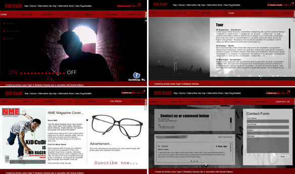
This first out of our two ancillary texts that we were required to produce was the unofficial kid cudi website. This meant we needed to create a basic structure for an fully functional website. We needed this website to consider our target audience greatly, as our target audience are the people who this website will be mainly appealing too. In order to make this website attractive to the users we needed to make sure we did the following points:
- Research into the layout, themes, design and basic structure of a website – For this we looked into Kid Cudi’s official website to gather a general idea of its design and themes that are incorporated within his genre.
- Furthered our research into the layout of the website and developed our understanding of the various sub headings and sections such as; an about page, gallery, tour dates, and music/video pages.
- Through doing this we could address our target audience by generating themes and designs around their interests in the dance/rap/pop genre and decide on the essential information that is given.
- Additional information on the artist such as; reviews, album details and discography, music video and press articles/ shoots.
- Specific focus on; branding, colours, themes, photography, biography, font and text, etc.
- A section dedicated to our music video for Kid Cudi– this was a useful way of enforcing our music video’s association with artist, and a successful method on our target audience.
- Various photos linked to our music video and the type of visual connections to Kid Cudi, this maintained the happy feel of the website, including cultural images created through intertextuality. This also allowed us to bring in the photography software package of Digital Photo Professional, where we were able to manipulate the images to the themes of the artist.
- Effective imagery and material that aids the audience in interpreting Kid Cudi’s image and music, just as Kid Cudi’s official website creates associations on us.
http://www.wix.com/modeyv/kid-cudi#!
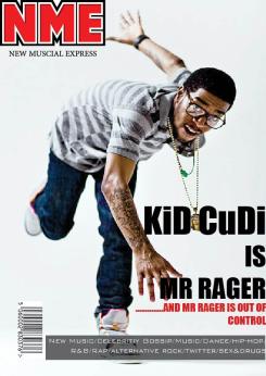
The second ancillary text that we wanted to focus on was a magazine cover that would help support advertisements based around the promotion of Kid Cudi, through using the mass read, cultural music magazine NME. Due to the massive popularity of NME, I decided to base our magazine cover on NME’s unique style of layout and writing. By doing this it feels extremely satisfying to know how successful the magazine is in terms of marketing and promoting the singer. Therefore before I could begin to create the magazine cover and the advertising within the magazine, I wanted to research some aspects of a magazines design to make it visually appealing and successful;
 TEXT – The text and fonts used in this advertisement has involved in all ancillary texts. In terms of the magazine design/article it has allowed the audience to associate with NME’s unique logo and layout. which was exactly what we did when regarding the advertisements and homepages, we all looked at Kid Cudi’s house style and what makes him different and recognizable to the public eye and tried to allow the audience to establish and recognised Kid Cudi within our media products.
IMAGERY – The images that are used and how they might portray certain artists in this music industry. NME usually have a band or solo artist in which the main article of the magazine is centered around as the central focus of the layout, surrounding this image are subheadings that give an idea what to expect within the magazine.
COMPOSITION – both composition of the front cover of NME and the advertisement have conventions in which we had to recreate. As mentioned above NME have a centred feature with surrounding sub articles, bar code and various other advertisements.
The main image of the magazine cover was designed on Adobe InDesign software. When it came to desiging the our own magazine I looked into existing magazines that had some correlation to music bands/artists. I found a well known company called NME to help advertise our artist regarding Kid Cudi and oiur music video Trapped in my mind. I done this by researching ino the previous NME issues nd was able to immediately identify their logo, fonts used, imergy and composition. From this research and obvservation we were able to use realisitic associaitions to NME such as the nutorious logo, which we used and cropped it to make it look presentable in our magazine. We made sure we kept the colour scheme and specific fonts the same as this is what successfully identifies the magazine to our target audience. When desigining a magazine I used the conventions of exisiting magazines and noticed that any imergy is normally the centre feature, referring back to the effective techniques of NME’s composition. Allowing me to create a perfect marketing point for Kid cudi and pull the main attention away from any subheadings and extra information about the organisation.

